
1Triggering emotions and creating moods are very important aspects of commercial interior design. Getting these effects depends on the choice of color. Cold colors have a calming effect while warm shades are stimulating. Achieving this depends on tone, dose, and chromatic combination. You need a professional commercial interior designer to guide you in the right colors for your office. Skilled interior designers understand the use of appropriate color effects in Commercial Interior Design to manipulate emotions and influence behavior.
There is a chance of falling prey to the latest color trends for their passing appeal and fresh charm. The rule of thumb is to select colors with the ideal functionality in your office. Your choice of color should match aspects like calm introspection, invitation, and brain stimulation. The choice of color determines business perception making it essential to avoid relying on just instincts. Read on to understand how to select the right color for your office interior design.
White
This color symbolizes innocence, purity, and simplicity. White in commercial interior décor portrays spirituality and light. When looking forward to a minimalistic appeal, white is a great choice for its simplicity and cleanliness. Real estate brokers find it easier to sell spaces painted white. For its lack of psycho-therapeutic effect, white is ideal for use in hospitals and medical offices.
When looking forward to evoking a clean sterile appeal, white is a great choice. White in commercial interior design creates a sense of purity and simplicity especially for spaces focusing on a return to nature. A combination of wood tones with immense greenery in your interior design will make your office design truly stand out.
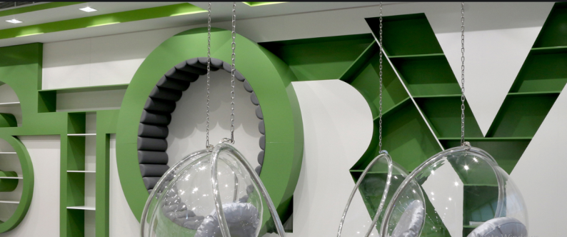
Black
Despite being at the chromatic spectrum end, black oozes sophistication, elegance, and dignity in commercial interior design. A professional interior design company in Dubai can use this mysterious color to create a romantic setting in your space. Combining white and black in interior design creates a powerful contrast to portray refinement and drama. Black is ideal for accent pieces to emphasize the shape of your interior’s structural elements. Commercial interior design with white and black portrays freshness and cleanliness which are very pleasant to the eye.
Red
For passion and strength, red is the ideal color. This demands attention and stimulated the brain without being soft or shy. Red should be used in moderation to avoid overshadowing other colors or becoming exhausting. This color is ideal for logos and signage for capturing attention. Using red with other bright colors in commercial interior design creates a refreshing environment filled with energy.
Gray
This color is a wonderful option for backgrounds since it just whispers instead of shouting. Being neutral allows gray to allow bright accents to shine. Avoid using gray in extremes to avoid becoming boring although it might look calm and safe. Commercial interior designers use vibrant colors to give a gray life. Warming up gray requires pairing it with natural tones. Gray is also paired with black and white to create a high contrast combination.
Orange
Places like gyms are painted orange for a combination of red’s stimulating qualities and creating a visual call to action. The softer tones of orange enhance the playfulness and cheerfulness of yellow. The trick to selecting an ideal color in commercial interior design is to enhance the powerful effect of tones. Orange is ideal for commercial spaces to make them sociable while attracting energetic extroverts. Including this color in interior design creates positive energy and joviality.
Purple
For its exclusive character, purple is a color of privilege and royalty. Purple is valued in commercial interior design for triggering inspiration, mystical virtues, wisdom, creativity, and spiritual energy. Using purple in extremes is not necessary to avoid making the space look too pretentious and lonely. Purple is ideal for offices that value creativity and combining it with other bright colors makes it energizing and playful while evoking the richness of flavors.
Green
The eyes recognize green for symbolizes shelter, abundance, and safety. Using green in commercial interior design requires creating interest with extra colors and accent pieces. This is the trick to surely stimulate the brain. Green symbolizes nature making it a great choice for spaces that seek to portray environmentally friendly business practices.
Blue
This color is powerful at creating a clean and odorless feel in a commercial space. The interior designer can use blue with other colors for an ideal look. Light shades of blue make your space seem larger. To lessen the effect of the sun and heat, blue is an ideal color to make your space cool. This color creates calmness and contemplation.
Pink
Businesses targeting women benefit significantly from pink. This color is innocent and feminine making it ideal for commercial spaces that seek to attract women. Pink is reassuring and fresh while feeling safe for its calming effect and soft nature. This color is bright but not threatening to make it perfect for customers who desire fun and feeling refreshed.
Yellow
This happy color evokes the sun’s life-giving quality. Yellow brings out the playfulness and joy of summer making it very uplifting. However, the vibrant shades of yellow need use in moderation and softer shades are necessary when used in larger dosage. Yellow is a wonderful accent color for retaining its refreshing qualities.
In a nutshell
The choice of color in commercial design has a significant impact on the overall feel and look of your space. A professional interior design company will guide you on the right color choice to make your space inviting and refreshing.